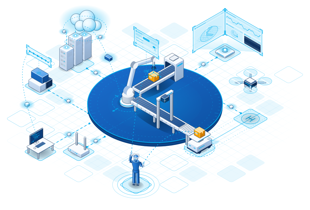
The hero animation of the home page is an isometric scene drawn with the kit of the news tiles: a robot arm moves parcels between two belts, a mobile robot and a drone carry them on, the cloud deploys the software that drives them, and an operator in Coarobo Sightline steers them. It is plain SVG animated with SMIL, in one version for each background, and its first frame is a still picture of its own, for documents and for readers who ask for reduced motion.
Every printed and presented document of Coarobo opens and closes on a band in medium gray that runs to the edges of the page. At one end of the band, a white plate whose edge leans at the angle of the stripes holds the full imagotype in a header, a lighter logo or a QR code in a footer, and the stripes sit at the other end: two flat bars in the blues of the brand and, at the page edge, a triangle in the dark gray of the former dark-themed documents, leaning perpendicular to the chevrons of the isotype. Flat colors print cleanly on any office printer, and the bands make every PDF look trimmed at a standard size.
Each of the six products has an accent color, its base, from which one rule derives four more shades, so that its numbers, icons, and cards read well in the light and the dark theme alike.
The product colors mark only the products, so the logos, the bands, the stripes, and the brand gradient keep the color palette above.
Coarobo and each of its six products have an app icon in the isometric style of the website: the chevrons of the isotype stand on either side of an object that evokes the product, on a tile in the colors of the product.
Each icon comes in a light appearance for light backgrounds and a dark appearance for dark backgrounds, and in three cuts, each drawn for the sizes it is shown at.